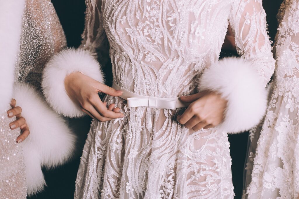
The Power of Color in 2026 Style
Color has always been a big part of how we express ourselves but in 2026, it’s everything. In a world driven by visuals, your outfit isn’t just worn, it’s broadcast. Whether you’re on a video call, posting a Reel, or just getting caught in someone else’s story, the colors you wear shape how you’re seen. Sharp, smart color choices cut through screen noise, make your features pop, and tell your story before you even speak.
But here’s the kicker: what looks good in person doesn’t always translate on camera. Digital filters, LED lighting, and auto correction tools can distort your outfit’s vibe fast. Saturation gets punched up. Whites can blow out. Pastels might vanish altogether. That makes understanding color under different lighting conditions less of a nice to have and more like survival.
There’s also a practical divide now between dressing for the moment and dressing for the grid. You might wear a soft olive coat out to lunch, but for content? Something bolder maybe cobalt or bright rust has more impact. It’s not about changing your whole wardrobe; it’s about learning to play color in two arenas: one real, one digital. And doing both with your own signature style.
Understanding Basic Color Theory
Color coordination starts with knowing what you’re actually looking at. First up: warm vs. cool tones. Warm tones lean red, orange, and yellow think sunsets, firelight, or autumn leaves. Cool tones fall in the blue, green, and purple range like oceans, pine forests, and soft shadows. A quick trick to spot the difference? Warm tones tend to feel energetic and cozy; cool ones are calming and crisp.
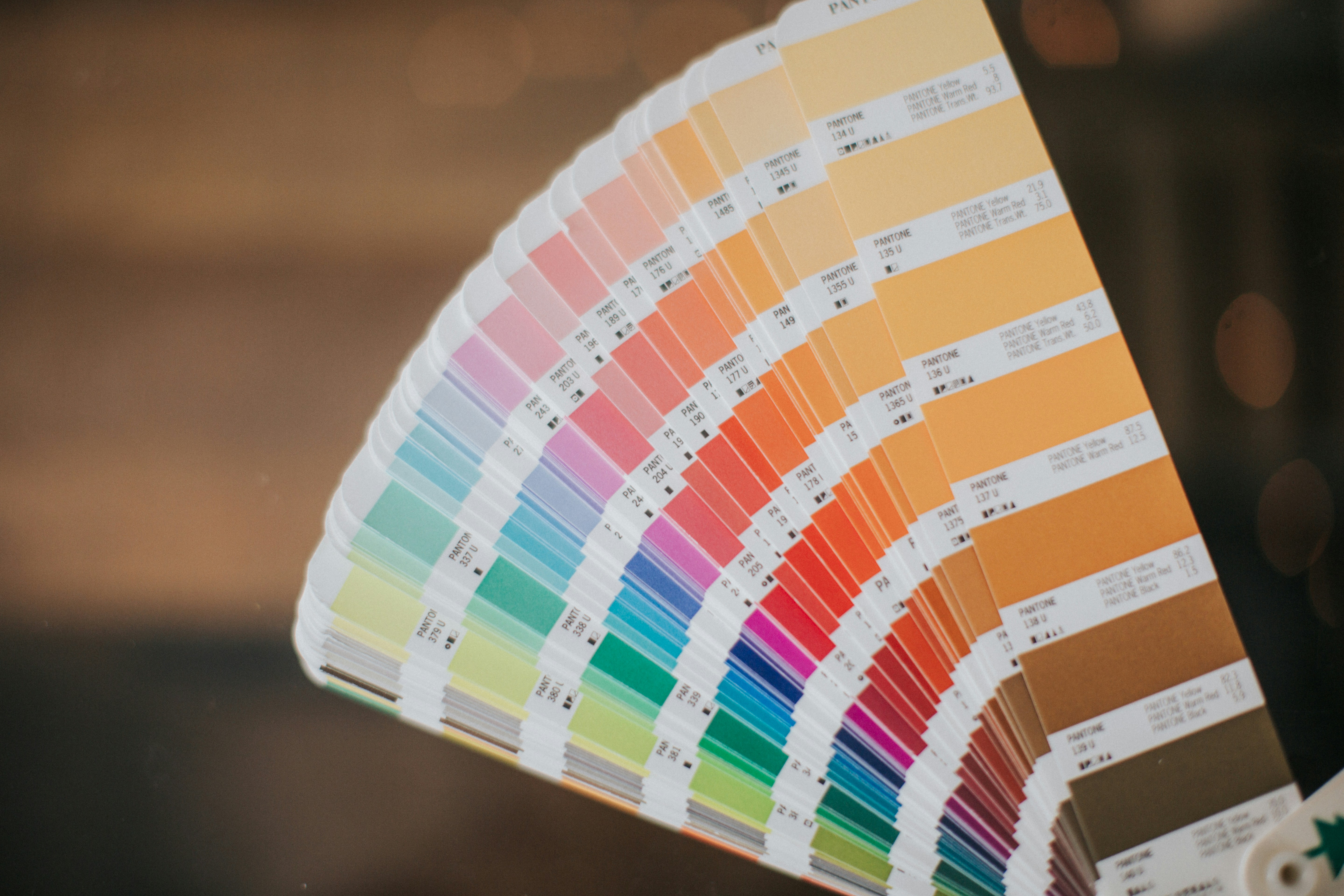
Next, let’s crack the color wheel. It’s divided into three layers: primary (red, blue, yellow), secondary (green, orange, purple from mixing primaries), and tertiary (colors like teal or magenta, made by mixing one primary and one secondary). It’s not just art school jargon this stuff actually matters when you’re trying to dress with intent.
From the wheel we get color schemes. Complementary colors sit opposite each other say, blue and orange and create bold contrast. Monochromatic schemes stick with one hue and play with lightness or darkness, great for clean, minimalist looks. Analogous palettes use colors next to each other, like green, teal, and blue less contrast, more flow.
Whether you’re layering neutrals or going full dopamine dresser, understanding these basics saves time and prevents closet meltdowns. Color theory isn’t about rules it’s about knowing the terrain so you can move through it with purpose.
Skin Tone, Undertones & What Flatters You
Understanding your skin’s undertone is one of the simplest ways to unlock the power of personal color coordination. It’s not just about whether your skin is light, medium, or dark it’s about what’s going on beneath the surface. The right tones can instantly brighten your look, while the wrong shades can unintentionally dull your features.
Identifying Your Undertone
Here are a few easy methods to help determine your natural undertone:
Vein Test: Look at the veins on your wrist under natural light.
Greenish veins? You likely have warm undertones.
Bluish or purple veins? Cooler undertones.
Can’t quite tell? You may be neutral.
Jewelry Test: Do you tend to look better in gold or silver?
Gold suits warm undertones.
Silver enhances cool undertones.
If both work, you’re likely neutral.
White Test: Hold up a true white shirt or cloth next to your face.
If your skin pops and seems clear, you probably have cool undertones.
If your skin looks warmer or more glowy, you’re likely warm toned.
How to Match Colors to Enhance Your Features
Once you’ve found your undertone, use that insight to pick shades that boost your natural beauty:
Warm undertones: Earth tones like olive, mustard, terracotta, coral, and warm reds harmonize beautifully.
Cool undertones: Jewel tones like emerald, sapphire, lavender, navy, and crisp whites generally flatter.
Neutral undertones: You can play in both worlds just avoid colors that are too saturated or too muted.
Tip: Don’t be afraid to test new shades outside your typical comfort zone how a color makes you feel sometimes outweighs traditional rules.
Universal Colors That Flatter Almost Everyone
While personal undertone matters, some shades just seem to work across the board. These versatile hues are great to lean on when you’re unsure:
Soft white (not stark white): Clean without washing you out
Teal: Balances cool and warm tones effortlessly
Blush pink: Adds warmth without overpowering
Eggplant (deep purple): A rich, flattering base for many looks
True red: A bold classic that surprisingly works with most skin tones
Having a few universal tones in your wardrobe makes mixing and matching much easier especially on days when you want to skip the color guesswork.
Remember, color isn’t just theory it’s personal. Start with the basics, experiment intentionally, and let your favorite tones evolve with your own style journey.
Building an Outfit Around a Color Focus
Start with one bold hue that’s your anchor. It could be a burgundy blazer, a cobalt skirt, or even a pair of sneakers in fire engine red. The point is to pick a statement color and let everything else orbit around it. No guesswork. No chaos.
Once you’ve got your centerpiece, contrast becomes a tool not a trap. Think of it as tension that gets the outfit noticed. Pair that cobalt with crisp white or charcoal. Use patterns sparingly, and only if they echo the main hue or add to the contrast with intent. Clashing for effect can work, but only if you’ve got the attitude and confidence to carry it.
To keep the whole thing grounded, layer in neutrals. Grey, black, navy, camel, olive they do the heavy lifting so your pop of color doesn’t scream. Think of neutrals as your visual insulation. They make bold look intentional instead of chaotic.
In the end, it’s about balance. One statement shade. A little tension through contrast. And a solid base of neutrals to tie it all together. That’s how you wear color without looking like you lost a bet.
Seasonal Color Coordination
Understanding how color shifts with the seasons isn’t just for runway stylists it’s essential for anyone who wants to show up looking intentional. Each season brings its own light, mood, and texture, and color choices should reflect that.
In spring, think fresh and soft: pastels like dusty rose, mint, butter yellow, and powder blue do well with layered neutrals like cream or cool beige. These combinations match the brighter, earlier daylight and feel in sync with the season’s reset.
Summer calls for saturation without overkill. Rich corals, turquoise, crisp white, and bold blues work well under strong sunlight. Layering gets lighter here linen shirts over tees, open weave knits with worn denim. The key is breathable colors that reflect light, not absorb it.
Fall is where earth tones take over burnt orange, olive, deep wine, and camel brown come alive. This is the season to experiment with texture too: wool, leather, corduroy. Layering becomes less about comfort and more about expression. Don’t be afraid to stack tones from the same family burgundy over rust, tan under olive.
Winter leans into contrast. Cool tones cut harder: charcoal, midnight blue, emerald, and stark white all carry through grey skies and short days. These shades layer well with heavier materials wool coats, structured knits, denim. The goal is to feel grounded but not flat.
For more technical detail on mastering weather aware layering, check out Layering Like a Pro: Fashion Tips for All Seasons.
Ending Outfit Regret: Common Mistakes to Avoid
Creating a well coordinated ensemble isn’t just about picking colors that “go together” it’s about balance and intention. Missteps in color choices can easily derail an outfit that otherwise had great potential. Here are the three most common color coordination mistakes to be aware of:
The “Too Many Colors” Trap
Trying to include too many bright or bold colors in one outfit can leave things feeling chaotic or overly busy. Simplicity is often more striking.
Avoid this by:
Sticking to a main color and supporting it with one or two accent shades
Balancing brights with neutrals to avoid visual overload
Using the 60 30 10 rule: 60% dominant color, 30% secondary, 10% accent
Overmatching: When Coordination Goes Too Far
While coordination is key, taking it too far matching every accessory exactly or using the same shade throughout can result in a flat or overly contrived look.
Avoid this by:
Mixing tones or textures within the same color family
Breaking up a monochromatic outfit with neutral or metallic accents
Giving your look variety with subtle contrast rather than perfect matches
Ignoring Lighting and Context
A color that looks great indoors might change completely under natural light or on camera. Failing to consider where your outfit will be seen can affect how it’s perceived.
Avoid this by:
Previewing your outfit under different lighting (daylight, fluorescent, warm indoor light)
Adjusting for camera exposure if you’re taking photos or filming
Wearing colors that support the atmosphere or tone of your environment (e.g., bolder for events, softer for professional settings)
By recognizing these common mistakes, you can make more thoughtful outfit choices and truly master the art of color coordination.
Quick Reference Guide: Go To Color Combos
Navy + Camel
A classic pairing that never gets loud but always speaks with purpose. Navy brings calm, authority, and structure camel softens it with warmth and an understated edge. This is the combo that says polished, not trying too hard. Perfect for blazers, coats, or layered separates when you want to look sharp without flashing.
Charcoal + Olive
Deep, cool charcoal meets earthy olive for a grounded, modern vibe. It’s the kind of palette that feels urban but not cold good for utility pieces, structured outerwear, or casual tailoring. Works especially well with matte fabrics and minimal accessories.
Ivory + Rich Brown
When softness meets strength. Ivory keeps things light and clean; rich brown adds depth and a sense of handcrafted luxury. This duo plays well in textures think knitwear, leather, or suede. Ideal for fall or anytime you want a palette that feels grounded and grown.
Soft Pink + Slate Grey
This one’s for when you want contrast without clashing. Soft pink brings warmth and a touch of romance, while slate grey reins it in with a cool, controlled finish. It’s a balanced combo great for mixing fluid pieces with structure, or casual outfits that still feel considered.
Keep these in your back pocket. They’re versatile, they photograph well, and they leave room for personality without drowning it in noise.
Bring It All Together
Understanding color theory is one thing. Making it work in your actual closet is another. Start practical: build a color cheat sheet based on what you already own. Pull your go to outfits and lay them out. What colors repeat? What pairings happen naturally? Note down your base neutrals and accent shades. Keep this guide somewhere easy to reference on your phone or inside your closet door will do.
Next, take photos of full outfits you wear and like. Over time, patterns show up: what hues you wear most, what combinations feel right in real life and on camera, and where things fall flat. Pictures don’t lie, and they’ll help you decode your real world style in a way memory can’t.
Lastly, give it time. Style is built through repetition and small risks. You don’t have to overhaul your wardrobe overnight. The goal is to sharpen your eye until smart color choices become instinct, not effort. That takes time, and that’s fine. Test, tweak, trust the process.